Note
Go to the end to download the full example code
Display sequence similarity in a heat map#
The following script visualizes the sequence alignment of six proteins of the human Phosphoinositide 3-kinase (PI3K) family, including PI3K itself.
At first we fetch the respective sequences. and align them using Clustal Omega.
# Code source: Patrick Kunzmann
# License: BSD 3 clause

import warnings
import matplotlib.pyplot as plt
import numpy as np
import biotite
import biotite.application.clustalo as clustalo
import biotite.database.entrez as entrez
import biotite.sequence as seq
import biotite.sequence.align as align
import biotite.sequence.graphics as graphics
import biotite.sequence.io.fasta as fasta

uids = ["5JHB_A", "5LUQ_A", "5FLC_B", "5YZ0_A", "5NP0_A", "4FUL_A"]
names = ["PI3K", "DNA-PKcs", "mTOR", "ATR", "ATM", "hSMG-1"]

sequences = []
file = fasta.FastaFile.read(
    entrez.fetch_single_file(uids, None, db_name="protein", ret_type="fasta")
)
for header, seq_str in file.items():
    sequences.append(seq.ProteinSequence(seq_str))

alignment = clustalo.ClustalOmegaApp.align(sequences)
Since the sequences are relatively long, the display of the entire
alignment using a plot_alignment() would be too big.
Instead we use a heat map, which highlights the similarity in the
alignment column using a color map.
Like the LetterSimilarityPlotter we will use the
average normalized similarity as measure.
def get_average_normalized_similarity(trace_code, matrix, seq_i, pos_i):
    code1 = trace_code[seq_i, pos_i]
    if code1 == -1:
        return np.nan
    similarities = np.zeros(trace_code.shape[0])
    for i in range(trace_code.shape[0]):
        code2 = trace_code[i, pos_i]
        if code2 == -1:
            similarities[i] = 0
        else:
            sim = matrix[code1, code2]
            # Normalize (range 0.0 - 1.0)
            min_sim = np.min(matrix[code1])
            max_sim = np.max(matrix[code1])
            sim = (sim - min_sim) / (max_sim - min_sim)
            similarities[i] = sim
    # Delete self-similarity
    similarities = np.delete(similarities, seq_i)
    return np.average(similarities)


matrix = align.SubstitutionMatrix.std_protein_matrix()
# Get the alignment columns as symbols codes (-1 for gaps)
trace_code = align.get_codes(alignment)
similarities = np.zeros(trace_code.shape)
for i in range(similarities.shape[0]):
    for j in range(similarities.shape[1]):
        similarities[i, j] = get_average_normalized_similarity(
            trace_code, matrix.score_matrix(), i, j
        )

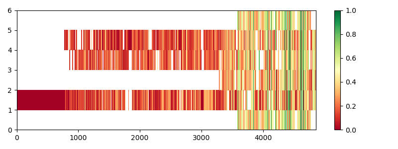
figure = plt.figure(figsize=(8.0, 3.0))
ax = figure.add_subplot(111)
heatmap = ax.pcolor(similarities, cmap="RdYlGn", vmin=0.0, vmax=1.0)
cbar = figure.colorbar(heatmap)
figure.tight_layout()

/home/runner/work/biotite/biotite/doc/examples/scripts/sequence/homology/pi3k_alignment.py:85: MatplotlibDeprecationWarning: Getting the array from a PolyQuadMesh will return the full array in the future (uncompressed). To get this behavior now set the PolyQuadMesh with a 2D array .set_array(data2d).
  cbar = figure.colorbar(heatmap)
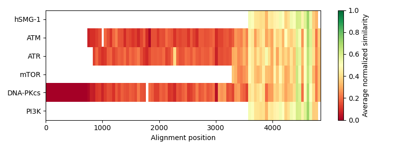
As the plot creates a heatmap field for every alignment column, the plot looks quite confusing. It is not clearly visible, which parts of the sequences have a low or high similarity to each other. Hence, we create bins, that contain the mean similarity over a range of columns.
def calculate_bins(similarities, bin_count):
    edges = np.linspace(0, similarities.shape[1], bin_count, dtype=int)
    edges = np.append(edges, similarities.shape[1])
    binned_similarities = np.zeros(similarities.shape)
    for i in range(similarities.shape[0]):
        for j in range(len(edges) - 1):
            binned_similarities[i, edges[j] : edges[j + 1]] = np.nanmean(
                similarities[i, edges[j] : edges[j + 1]]
            )
    return binned_similarities


with warnings.catch_warnings():
    # Catch warnings about empty slice for gap-only parts
    warnings.simplefilter("ignore")
    similarities = calculate_bins(similarities, 100)

figure = plt.figure(figsize=(8.0, 3.0))
ax = figure.add_subplot(111)
heatmap = ax.pcolor(similarities, cmap="RdYlGn", vmin=0.0, vmax=1.0)
cbar = figure.colorbar(heatmap)
# Furthermore, add some labels to the figure
cbar.set_label("Average normalized similarity")
ax.set_xlabel("Alignment position")
ax.set_yticks([0.5, 1.5, 2.5, 3.5, 4.5, 5.5])
ax.set_yticklabels(names)
figure.tight_layout()

/home/runner/work/biotite/biotite/doc/examples/scripts/sequence/homology/pi3k_alignment.py:117: MatplotlibDeprecationWarning: Getting the array from a PolyQuadMesh will return the full array in the future (uncompressed). To get this behavior now set the PolyQuadMesh with a 2D array .set_array(data2d).
  cbar = figure.colorbar(heatmap)
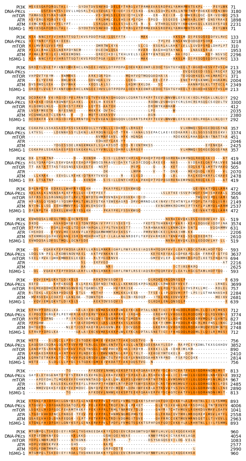
Finally we show the alignment columns without the terminal gaps of the PI3K sequence, comprising the more conserved parts.
Since the alignment is still relatively long, we will reduce the size of the font and the backgrounbd boxes, to fit more alignment columns into one line.
# Find start position and exclusive stop position of 'PI3K' sequence
# (index 0)
trace = alignment.trace
# From beginning of the sequence...
for i in range(len(trace)):
    # Check if all sequences have no gap at the given position
    if trace[i, 0] != -1:
        start_index = i
        break
# ...and the end of the sequence
for i in range(len(trace) - 1, -1, -1):
    # Check if all sequences have no gap at the given position
    if trace[i, 0] != -1:
        stop_index = i + 1
        break

# Truncate alignment to region where the 'PI3K' sequence exists
alignment.trace = alignment.trace[start_index:stop_index]

matrix = align.SubstitutionMatrix.std_protein_matrix()
fig = plt.figure(figsize=(8.0, 15))
ax = fig.add_subplot(111)
# The alignment is quite long
# -> Reduce font size to reduce figure size
graphics.plot_alignment_similarity_based(
    ax,
    alignment,
    matrix=matrix,
    symbols_per_line=80,
    labels=names,
    show_numbers=True,
    label_size=10,
    number_size=10,
    symbol_size=6,
    color=biotite.colors["orange"],
)
fig.tight_layout()

plt.show()
